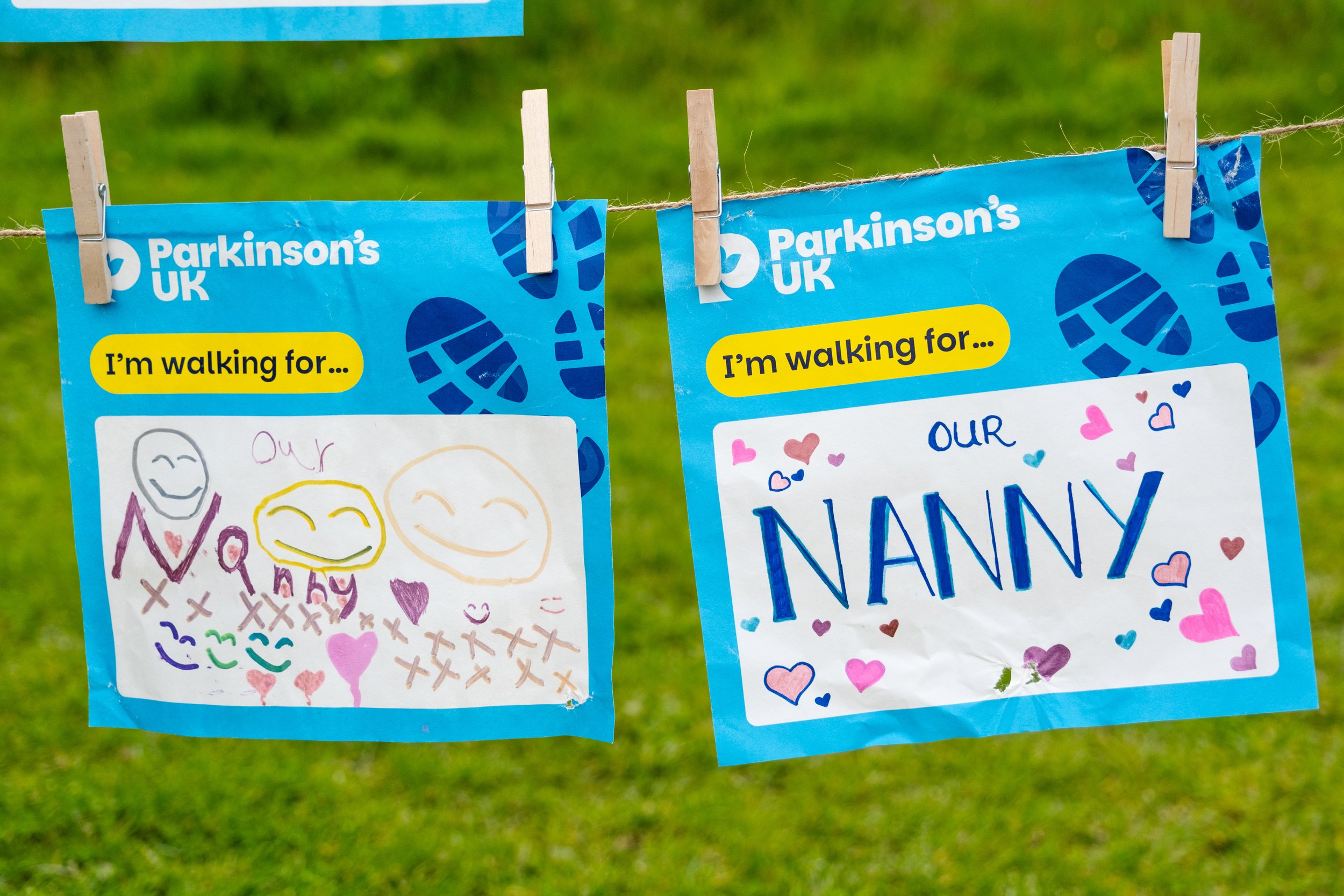
Walk for Parkinson’s – Campaign Identity Refresh
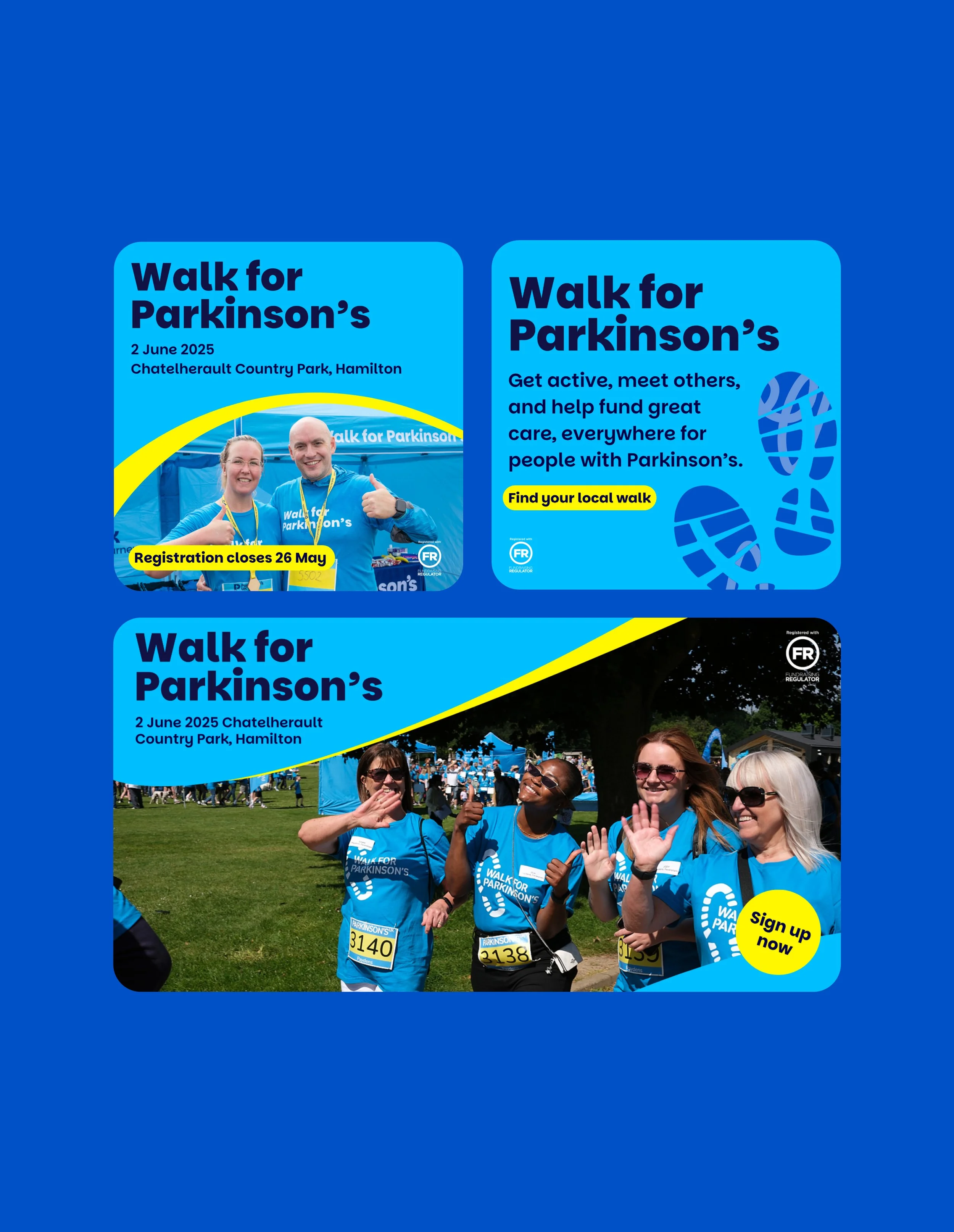
Walk for Parkinson’s is Parkinson’s UK’s flagship community fundraising programme, consisting of 15 in-person events across the UK and a month long virtual event. As part of the charity’s wider brand refresh, the campaign required a new visual identity that aligned with updated brand guidelines while maintaining enough familiarity to remain recognisable and trusted by long-time supporters.
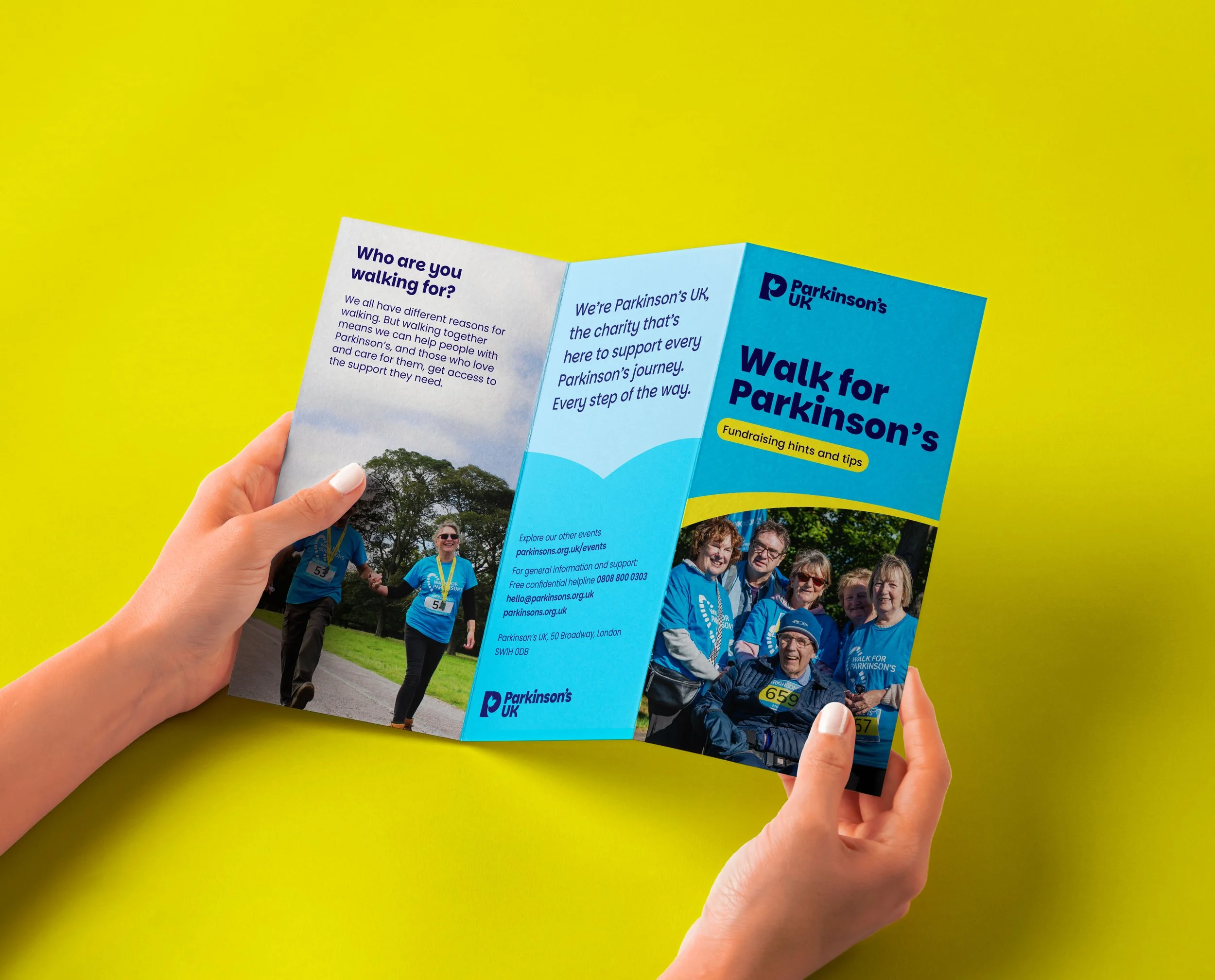
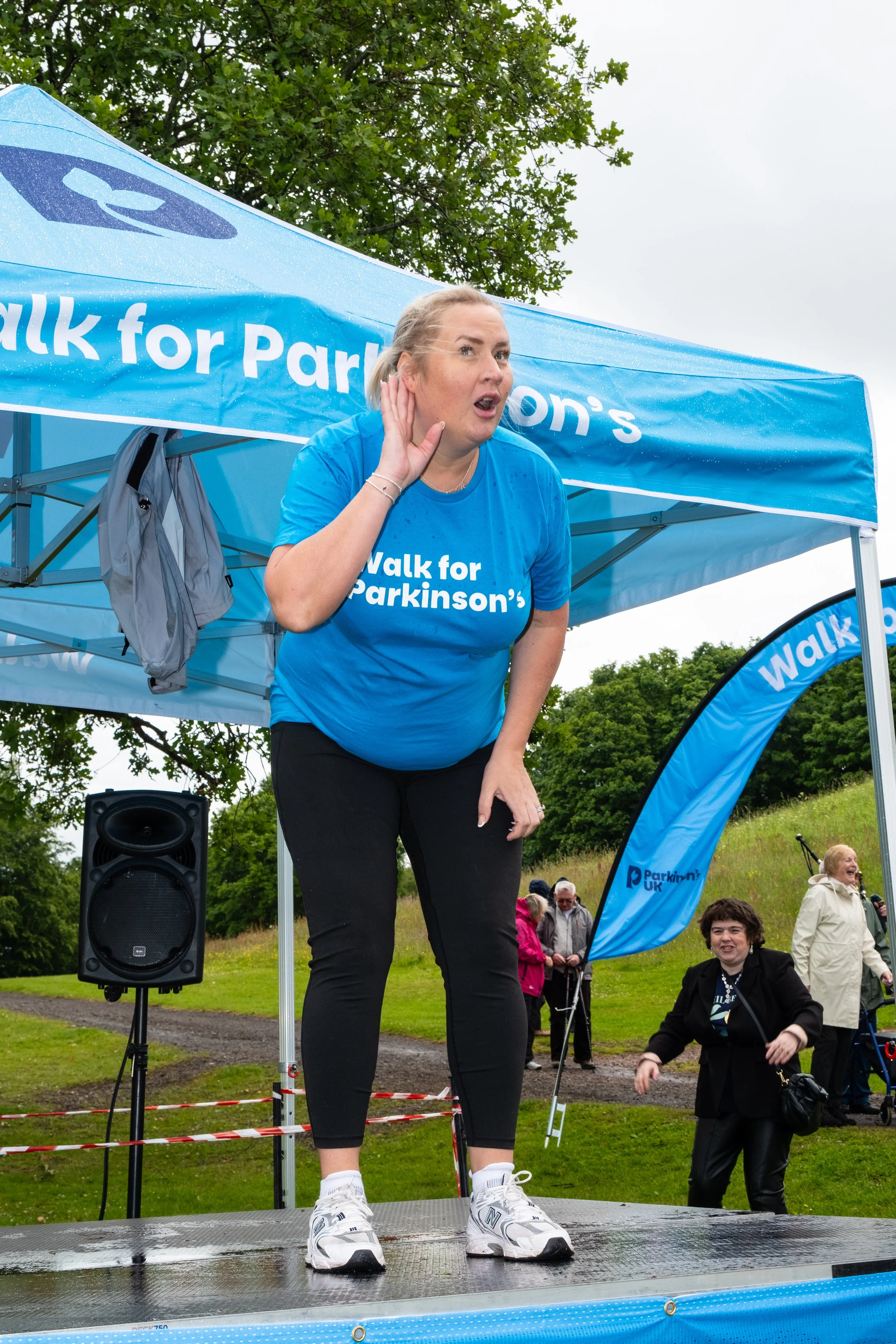
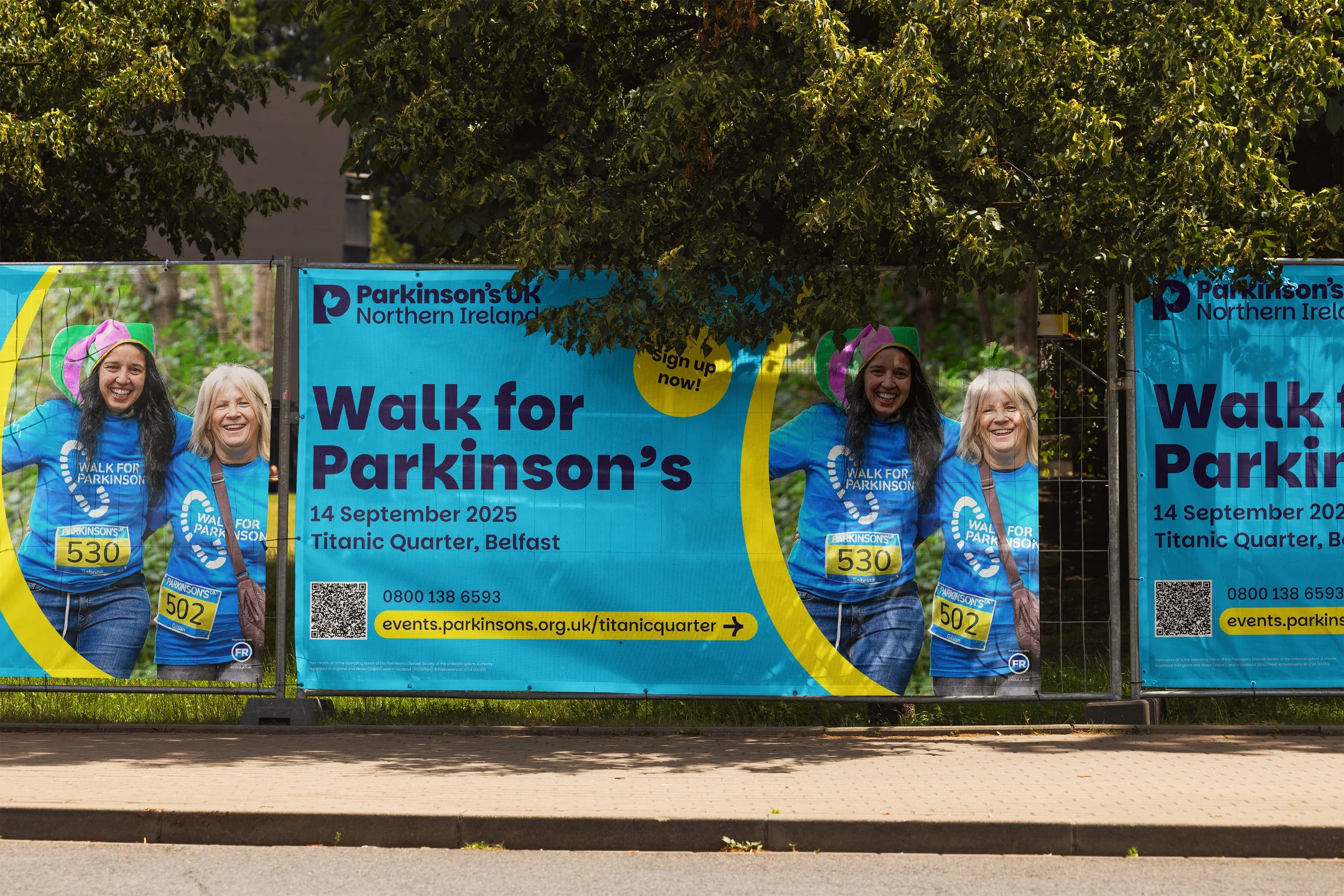
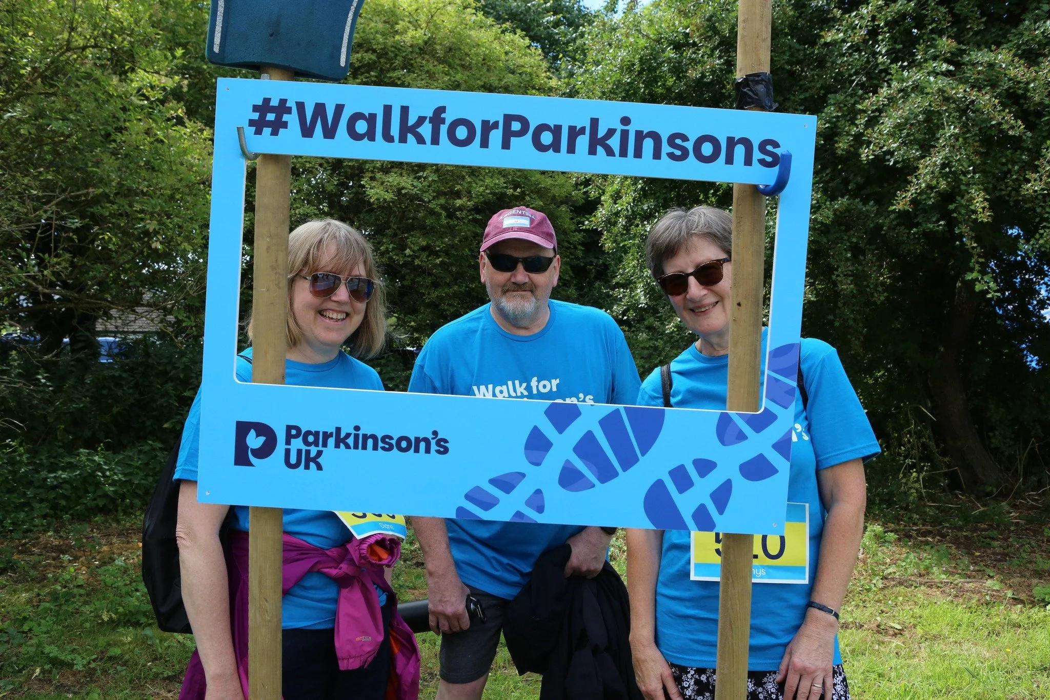
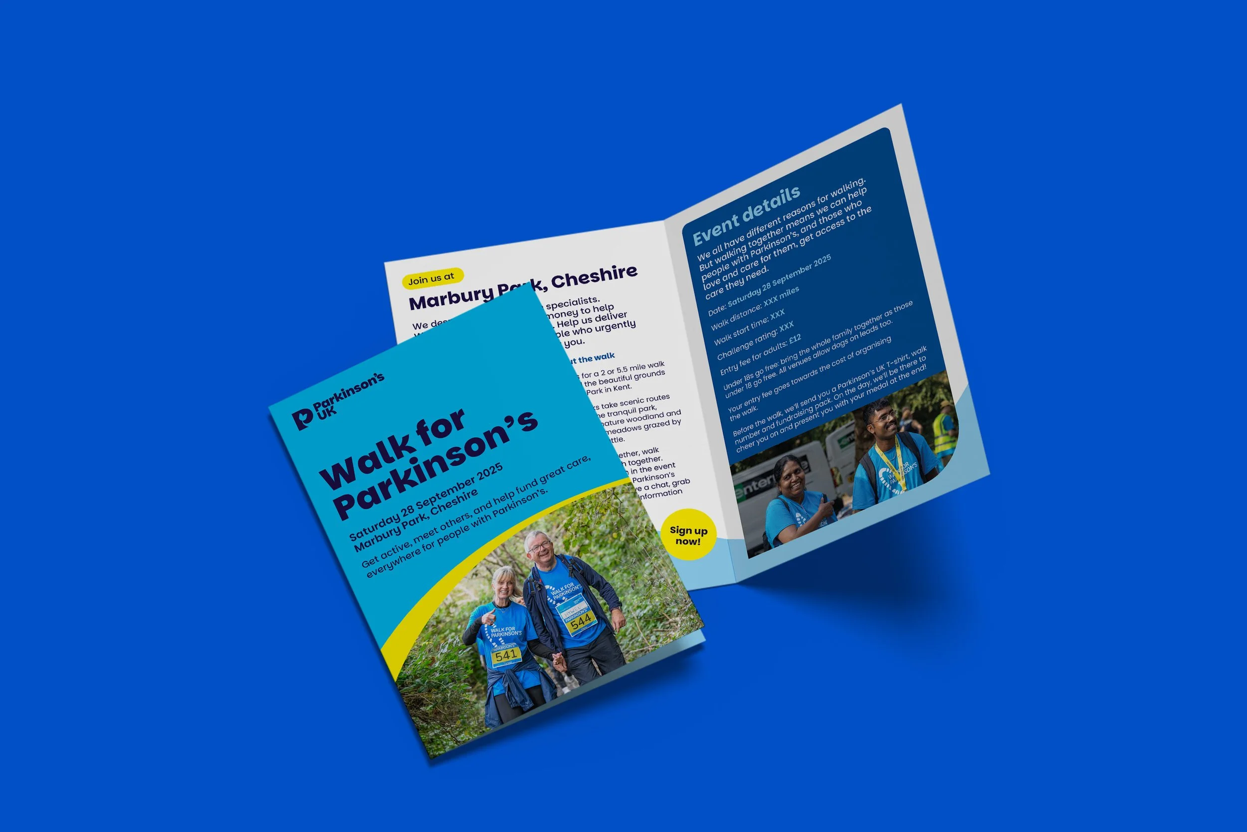
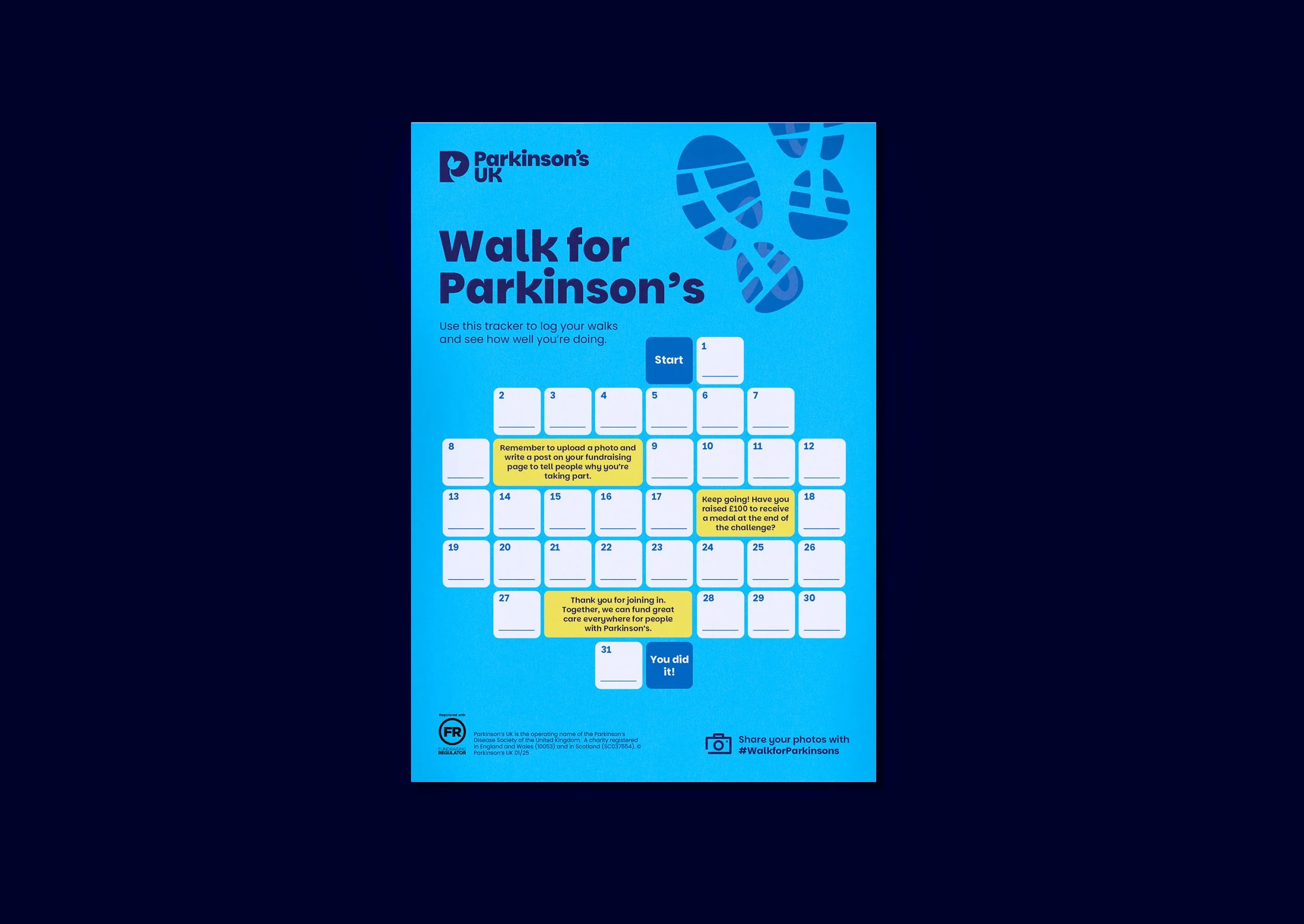
We began by exploring ways to apply the refreshed brand assets and expanded colour palette to the campaign. This included experimenting with illustration styles and a typographic approach that highlighted the personal stories and quotes of participants. Ultimately, we opted for a direction more closely aligned with the previous year’s look and feel — retaining the distinctive blue and yellow colour combination and the trainer print motif. This decision was based on positive feedback and testing from the previous campaign, allowing us to maintain familiarity while subtly evolving the identity.
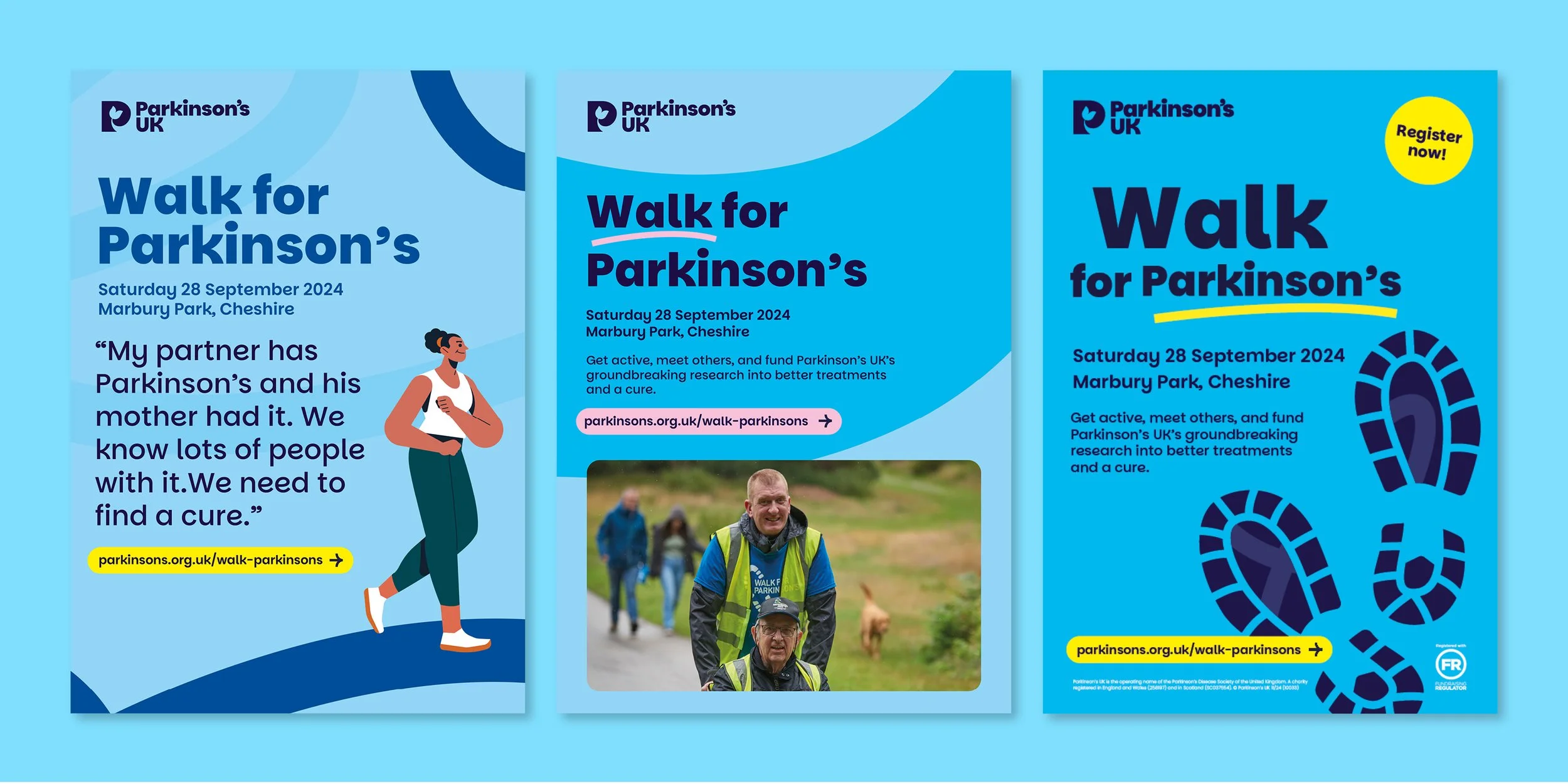
*Other creative approaches
Year: 2025
Client: Parkinson’s UK
Role: Graphic Designer